Table of Contents
Carpet Color Trends: How to Match Your Flooring with Your Interior Design
Carpet has come a long way from the wall-to-wall beige look many of us grew up with. In 2026, it is stepping into the spotlight with smarter designs, better materials, and color choices that actually work with your space instead of clashing with it.
If you are updating a single room or planning a full home refresh, choosing the right carpet color can have a bigger impact than you might expect. It is not just about what looks good. It is about how the space feels when you walk in.
The latest carpet color trends are focused on comfort, flexibility, and low-maintenance style. Think soft neutrals, modern textures, and deeper tones that add dimension without overwhelming the room. There are options for every kind of home, from simple and relaxed to bold and cozy.
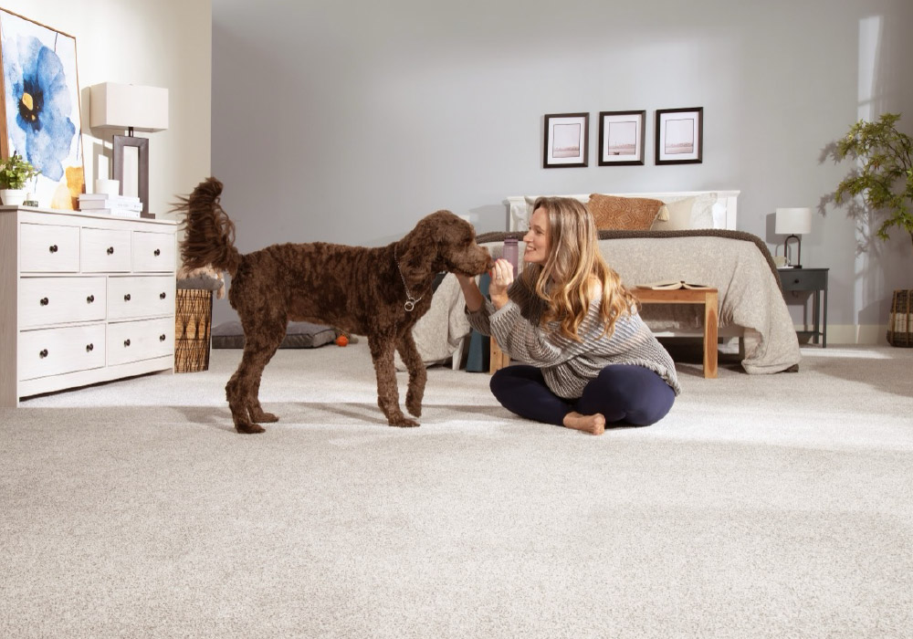
If you are not sure where to begin when it comes to picking a carpet color, you are in the right place. A few smart tips can help you narrow down the choices and find a color that fits your space, your style, and your day-to-day life.
Top Carpet Color Trends for 2026
In 2026, the most popular carpet trends are all about real-life comfort and simplicity. Homeowners want carpet that feels soft, holds up to daily wear, and still looks stylish without being too bold or hard to match.
Carpet is no longer just something to cover the floor. It’s part of the overall design. The right carpet color can pull a room together, add warmth, and bring out the best in your furniture and flooring.
Warm neutrals are back in style
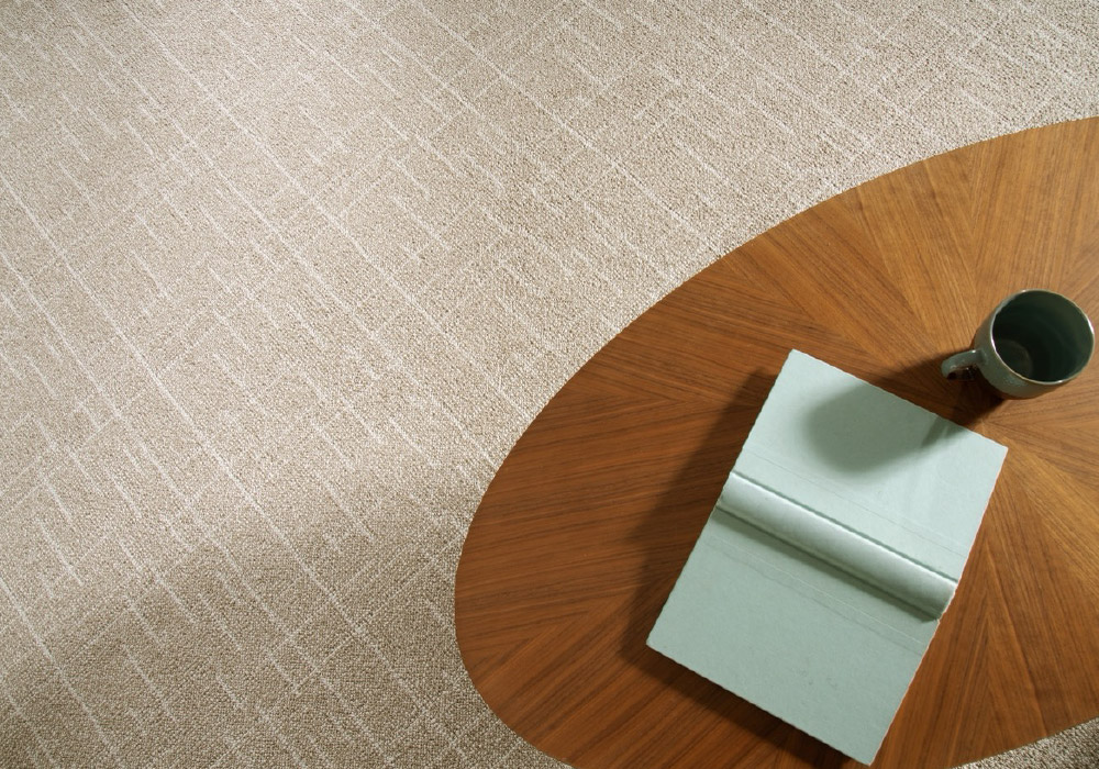
Gray had its moment, but now warmer tones are leading the way. Shades like beige, taupe, and soft browns are becoming go-to choices. These neutral carpet colors are easy to pair with wood or stone floors and add a cozy, natural look to any room.
Here are a few great examples to consider:
- Karastan Grateful Retreat Sandcastle Carpet – A soft, sandcastle-toned pattern made from durable Kashmere nylon.
- Mohawk SmartStrand Collection – Available in multiple taupes and beiges, perfect for high-traffic spaces.
Rich earth tones and jewel shades
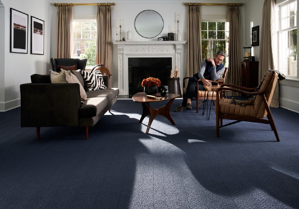
Looking to bring in more color? Deep tones like emerald green and sapphire blue are showing up in bedrooms and living rooms. These jewel tones add a little drama without taking over the space. They work best when paired with neutral walls and simple décor.
Here are a few great examples to consider:
- Lavish Linen Everstrand Patterned Carpet (Soft neutral tones...)
- Grand Lake Hale Navy Carpet (Rich navy hue...)
Texture makes a difference
Flat carpets are being replaced by more textured options. Styles like berber, cut and loop, and soft twists help hide wear and give the room more depth. Homeowners are using these textures to add interest, especially in minimalist or low-furniture spaces.
Looking for texture? Here are a few great examples to consider:
- Mohawk Textured Carpet Options – Choose from loop, cut-pile, and cut-and-loop textures.
- Karastan Textured Carpet Selections – Modern options built for comfort and performance.
Patterns with purpose
Tone-on-tone designs, small geometric patterns, and berber flecks are growing in popularity. These subtle styles add movement to a room without clashing with other features. They're especially common in home offices, family rooms, and modern interiors.
Here are a few great examples to consider:
- Karastan Grateful Retreat Sandcastle Carpet – A perfect balance of subtle pattern and soft color.
- Structural Charm Patterned SmartStrand Carpet (Brings a refined patterned texture...)
Feel free to explore these options further on the Carpet Exchange website to find the perfect fit for your home.
How to Match Carpet with Your Flooring

Matching your carpet to your existing floors is one of the easiest ways to make a space feel pulled together. It’s not just about color. It’s about finding the right feel and tone so your carpet works with the rest of your home, not against it.
Matc the tone of your floors
Before you pick a carpet color, check your floor’s undertone. If your hardwood or tile has warm tones, like oak or cherry, go with a warm neutral such as beige, taupe, or camel. For cooler-toned floors, stick with soft gray or greige.
This is especially important when matching carpet with hardwood floors, where color clashes can be more noticeable.
Use contrast to define the space
If your floors are dark, a lighter carpet can open up the room and make it feel brighter. A darker carpet paired with light floors adds warmth and helps ground the space. This contrast works well in large, open rooms where you want to break things up visually.
Think about how the room is used
In high-traffic areas, textured or multi-tone carpets help hide dirt and wear. Spaces like hallways, living rooms, and family rooms benefit from durable options that don’t show everything.
For quieter spots like bedrooms, softer colors and plush textures create a more relaxed feel. If you’re looking for carpet color ideas for living room updates, try a warm, medium-tone neutral that can handle both style and traffic.
And if you're planning to sell? Stick with safe options. The best carpet colors for resale are usually mid-tones that appeal to most buyers, shades like warm gray, oatmeal, or heathered blends.
Balance carpet with wall color
Your carpet and wall color combinations don’t need to match exactly, but they should feel related. A light cream wall with a light neutral carpet keeps things soft and open. A warm wall color pairs nicely with a medium-tone berber for added depth.
Avoid picking both at the same time without testing. Get samples, compare them in natural light, and see how they play off your flooring.
Should Carpet Be Lighter or Darker Than Your Floor?
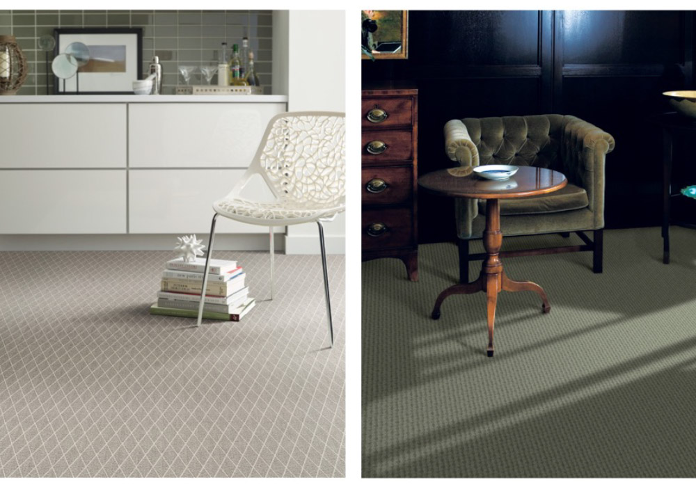
There’s no single rule when it comes to choosing between light or dark carpet. It all depends on how you want the room to feel. The right contrast can either brighten things up or make a space feel more grounded and cozy.
Go lighter to open up a space
If you want to make a room feel brighter or more spacious, lighter carpet colors are usually the way to go. This is especially helpful in smaller living spaces, or rooms that don’t get much natural light.
Light-colored carpets like off-white, soft beige, or warm ivory are popular because they create an airy, open look. These tones are also considered a safe flooring option when you’re aiming for a clean and modern feel.
Just keep in mind that light carpet may show stains more easily, so it works best in bedrooms or areas with less foot traffic.
Go darker for a grounded look
Darker carpet colors create contrast and make a room feel more intimate. They’re ideal for large rooms, open layouts, or anywhere you want to draw the eye downward and create a sense of warmth.
When paired with light or medium-tone wood, a darker carpet color helps define the space without overpowering it. This type of setup is often seen in carpet color ideas for living room designs where coziness is key.
Darker shades also hide dirt and wear better, making them a solid choice for high-traffic areas.
What works best for most homes
If you want something that’s easy to decorate around and works with a wide range of materials, go for a neutral carpet color that’s slightly lighter or darker than your flooring. This subtle shift in tone keeps the space from looking too flat, while still feeling cohesive.
Choosing the right light or dark balance depends on more than just your floor. Look at your wall color, furniture, and how much light the room gets. The goal is to pick a carpet that enhances the overall room feel, not one that competes with everything else.
Lighter vs. Darker Carpet: Pros and Cons
Use this quick comparison to guide your decision based on room size, lighting, and how you live.
| Lighter Carpet | Darker Carpet | |
|---|---|---|
| Room Effect | Makes the space feel larger and brighter | Creates a grounded, cozier feel |
| Best For | Small rooms, low-traffic areas, bedrooms | Large rooms, high-traffic areas, living rooms |
| Pairs Well With | Dark wood, mid-tone floors, minimalist or airy styles | Light floors, warm wood, traditional or modern styles |
| Visibility of Dirt | More likely to show stains and spills | Hides dirt, dust, and wear more effectively |
| Design Flexibility | Great for modern, coastal, and Scandinavian looks | Works well with rustic, boho, and dramatic interiors |
| Lighting Impact | Reflects natural light, brightens dull corners | Absorbs light, reduces glare in sunny rooms |
What Carpet Colors Go With Everything
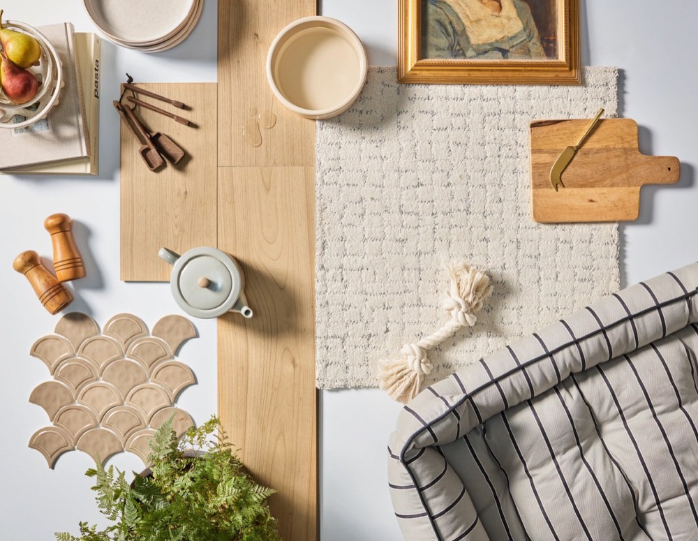
If you’re not sure where to begin, choosing a carpet color that works with almost anything is a safe and smart way to start. These colors offer flexibility no matter your style, wall color, or future design plans. Whether you're updating one room or thinking about long-term use, finding a color that fits any room keeps things simple.
Stick with trusted neutrals
Some colors just work every time. Popular neutral carpet colors like warm beige, soft taupe, greige, and oatmeal continue to top the list for a reason. They're calm, easy to match, and create a clean foundation that works in modern, traditional, or blended interiors.
If you want your furniture, wall color, or artwork to be the main focus, these shades make space for it. And if you're planning to sell your home soon, these are often the best carpet colors for resale because they appeal to a wide range of buyers.
Try multi-tone or flecked styles
Want even more flexibility? Multi-tone or flecked carpet styles can be a great option. These carpets combine two or more shades in a subtle way, helping to expand your color palette and hide dirt, lint, or wear over time.
Styles like berber or lightly patterned loop piles with flecks of color are especially popular in living rooms or family rooms where the flooring needs to handle daily use and still look good with different kinds of decor.
Test it in your space
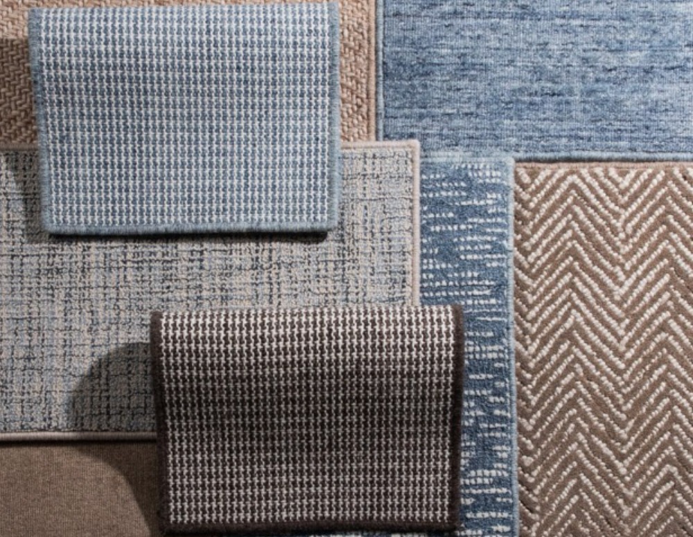
Even the most universal carpet color needs to work in your home’s actual lighting. What looks like the perfect tone under showroom lights might feel totally off in your space.
Before making a final choice, bring a few samples home and test them out during the day and in the evening. Natural light, artificial lighting, and surrounding colors can all shift how the carpet reads in the room.
Keep it balanced
A carpet that goes with everything should still feel like part of the room, not just a neutral background. Look for something that is soft and flexible, but also has just enough texture or tone to keep the room from feeling flat.
The goal is balance. You want a color that lasts, fits into your space easily, and feels finished without needing constant adjustment.
How to Choose the Right Carpet Color for Your Home
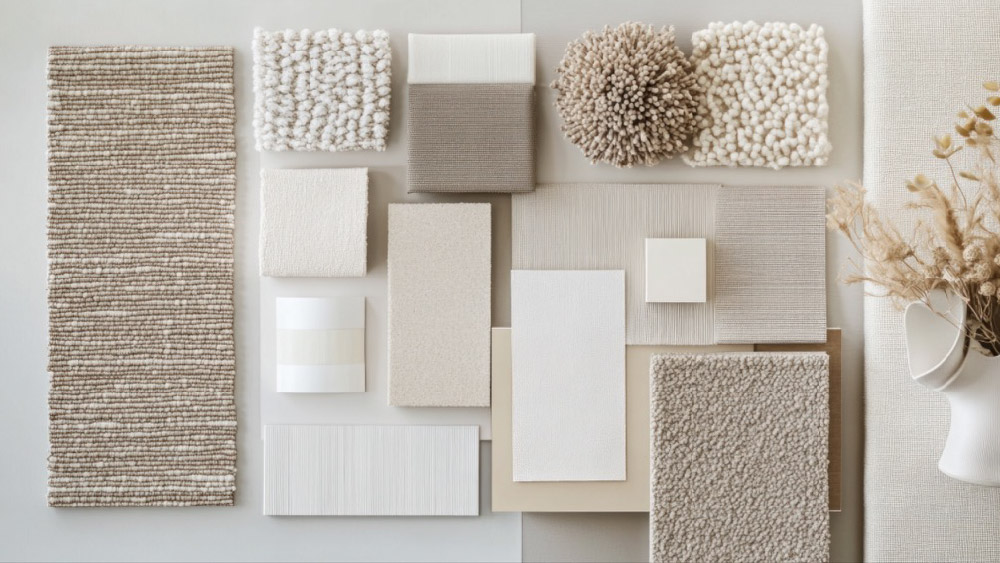
Picking the right carpet color is not just about what’s popular. It should fit your space, match your furniture, and hold up to your daily routine. With so many options out there, it can feel overwhelming at first. But with a few simple steps, you can narrow things down and make a choice you’ll be happy with.
Consider your lifestyle
Before you get caught up in color swatches, take a step back and think about how you live. Do you have kids? Pets? High-traffic areas that need extra durability? If so, look for stain-resistant carpets or styles with mixed fibers that hide wear and spills better.
These details make a big difference, especially in living spaces like family rooms or hallways. A great-looking carpet won’t help much if it can’t handle your daily routine.
Look at lighting
The same carpet color can look totally different depending on your lighting. Natural light brings out warmth in beiges and taupes, while cool-toned rooms might make the same color look flat or dull.
Test samples at home. Check them in the morning, afternoon, and at night under your regular lights. You’ll quickly see which shades actually work in your space.
Match the tone, not just the color
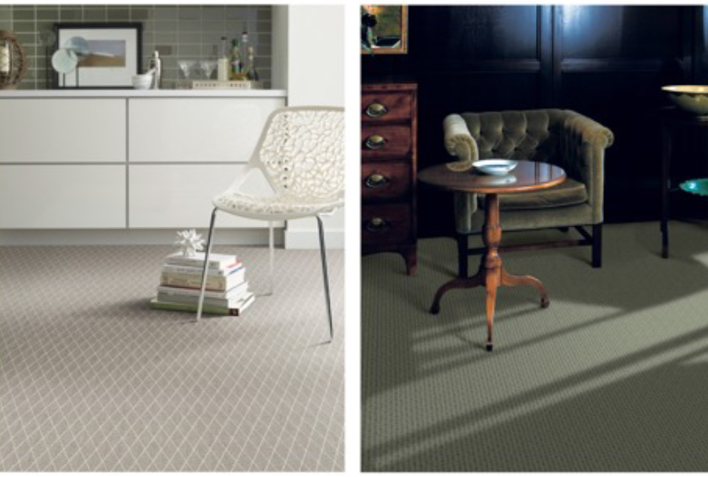
When people think about carpet and wall color combinations, they usually focus on color families. But tone is just as important. A soft cream wall pairs better with a warm neutral carpet than a cold gray one. Matching tones helps create flow and makes the room feel more balanced.
If your furniture or floors have bold finishes, go with a more subtle carpet color. If everything else in the room is minimal, a deeper or textured carpet can add depth without needing bold colors.
Test before you commit
No matter how confident you feel, always bring samples home. Lay them next to your flooring, your walls, and any major furniture. What looks perfect in the store might not translate in your actual room.
The best part? You don’t have to rush. The right carpet will not only look good, it’ll feel like it belongs.
Matching Carpet with Your Design Style
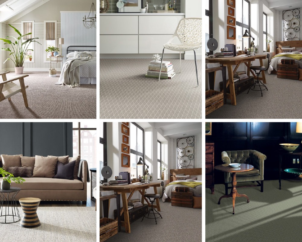
The style of your home has a big influence on the carpet you choose. The right match can pull everything together, while the wrong one can make a space feel disconnected or unfinished.
Knowing how different carpet colors, textures, and patterns fit with your interior design will make the decision a lot easier. Here’s how today’s most popular styles pair with the trending carpet styles of 2026.
Modern and Minimal
Modern spaces work best with clean lines and simple details. Go for neutral carpet colors like soft gray, taupe, or off-white. Flat or low-pile carpet works well here, especially with subtle geometric patterns that add texture without creating clutter. A cut and loop design is a good way to keep things interesting while staying understated.
Rustic or Farmhouse
Warm, lived-in tones are a perfect fit for rustic or farmhouse interiors. Look for carpet in warm beige, camel, or soft brown. Berber and loop pile styles add texture and match well with natural wood and raw finishes. These tones feel earthy and relaxed, which is exactly the vibe this style aims for.
Boho and Eclectic
f your space is full of color, texture, and unique finds, your carpet can either blend in or stand out. A multi-tone berber with flecks of color works great when you need something that ties everything together. Or, choose a bold solid tone that adds contrast to patterned walls or vintage furniture.
Traditional and Transitional
Classic design calls for balance. Stick with neutral carpet in tones like oatmeal, taupe, or warm gray. These shades pair well with wood furniture, detailed molding, and layered decor. Add subtle patterns or textures to keep the space from feeling flat while still honoring a timeless look.
Coastal and Scandinavian
These styles favor light, open spaces, so the carpet should reflect that. Choose light colors like cream, sand, or pale gray. Go for smooth textures and low-pile carpet to keep things feeling airy and minimal. Natural fibers or carpets with a subtle organic look help complete the relaxed, coastal feel.
A carpet that fits your design style doesn’t need to be bold. It just needs to feel like it belongs. Once you’re clear on the look you want, finding the right match becomes much easier.
Need more ideas? Check out our Carpet Inspiration gallery for real-life design looks and style pairings.
Final Tips Before You Choose Carpet
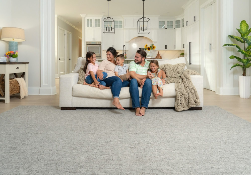
Choosing the right carpet doesn’t need to be complicated. Once you know your style, your needs, and how the space is used, everything else falls into place. Before you lock in a choice, here are a few quick reminders to help you avoid common mistakes.
What to keep in mind
- Don’t choose your carpet color in a showroom and expect it to look the same at home. Always test samples in your space, with your light.
- If you're installing new carpet next to hardwood or tile, aim for a smooth transition. Keep the tones consistent and the textures complementary.
- Avoid extremely light colors like white unless you’re working in a low-traffic area or love to clean.
- Not all neutrals are created equal. Warm and cool tones can look very different depending on your wall color or furniture.
- The best floor covering is the one that makes your space feel finished. A good carpet should support the look of the room, not fight it.
One last thought
Carpet is more than just something under your feet. It sets the tone for the entire space. Whether you're picking a soft neutral, a bold tone, or something textured and modern, the key is to choose with purpose.
Look for a carpet that fits your life, matches your design, and feels like it belongs in your home.
FAQs
What are the top carpet color trends for 2026?
Warm neutrals, textured styles, jewel tones, and subtle patterns are leading the 2026 carpet trends.
Should carpet be lighter or darker than the floor?
It depends on the room’s lighting and size. Lighter carpet can open up a space, while darker tones create warmth and hide wear.
What carpet colors go with everything?
Popular neutrals like taupe, oatmeal, and greige blend easily with most walls, floors, and decor styles.
How do I match carpet to my hardwood floors?
Match tones rather than exact colors. Pair warm wood with warm-toned carpet and consider contrast for visual balance.
What’s the best carpet color for resale?
Mid-tone neutrals are best for resale because they appeal to a wide range of buyers and complement many decor styles.

