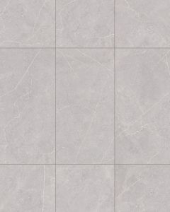
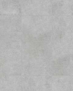
The Bedrosians Bluerun Atlas Gray Matte Porcelain 24"x36" Tile Collection captures the timeless beauty of Southern Belgium’s natural bluestone, once covered by the sea. Its subtle textures and fossil-like impressions add depth, elegance, and a sense of history to any space. Bluerun Atlas Gray Matte Porcelain 24"x36" Tile offers a variety of options, including 12x24 and 24x24 field tiles, 24x36 R11 pavers, and 4x4 mosaics, all available in three distinct colorways. Proudly made in the USA at a Green Squared certified facility, BlueRun combines sustainable practices with exceptional design. Whether used in residential or commercial use, indoors or outdoors, this versatile tile enhances any environment with its unique, nature-inspired aesthetic.
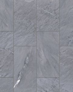
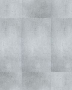
V3 - Moderate and significant variation in patterns and/or colors between tiles.
Thickness
2 cm
Color Swatches
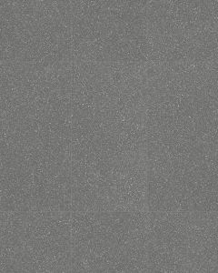
Atlas Gray
Description
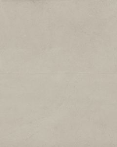
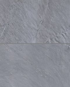
The Bedrosians Bluerun Atlas Gray Matte Porcelain 24"x36" Tile Collection captures the timeless beauty of Southern Belgium’s natural bluestone, once covered by the sea. Its subtle textures and fossil-like impressions add depth, elegance, and a sense of history to any space. Bluerun Atlas Gray Matte Porcelain 24"x36" Tile offers a variety of options, including 12x24 and 24x24 field tiles, 24x36 R11 pavers, and 4x4 mosaics, all available in three distinct colorways. Proudly made in the USA at a Green Squared certified facility, BlueRun combines sustainable practices with exceptional design. Whether used in residential or commercial use, indoors or outdoors, this versatile tile enhances any environment with its unique, nature-inspired aesthetic.
Dcof
>0.42: Recommended in areas that may be prone to wet situations.